
Change category colour across plots in Seaborn
This world deserves prettier plots

Self-quarantine gets me nerd-out on small things that I usually googled again and again.
For example, very often I need to plot multiple plots sharing the same category, where it’s better to keep colors across categories consistent for all the plots.
The easiest solution to make sure to have the same colors for the same categories in different plots would be to manually specify the colors at plot creation.
Alternatively, we can use a list of colors or a dictionary to map colors onto categories. I will be using dictionary in the following example.
The example is to plot New York City housing price and rental price across boroughs.
- Import packages
import numpy as np
import pandas as pd

import matplotlib.pyplot as plt
import seaborn as sns
import pyplot_themes as themes
%matplotlib inline
%config InlineBackend.figure_format = 'retina'
Don’t repeat ourselves, so…
If you have particular settings that you want to apply to all of your plots, you can use Matplotlib rcParams to do so. Changing the settings of rcParams will affect all subsequent plots. For example, if you want all plots to have the size 12 x 8 inches instead of the default 6 x 4 inches, you can write:
plt.rc('figure', figsize=(12, 8))
To change rcParams settings, you pass first the group you want to change its settings (in the example above, the group is 'figure') then you pass the settings you want to change with their values. For a complete list of rcParams, click here.
- specify palette with customized colors
self_palette ={'Brooklyn':'#56bdff',
            'Manhattan':'#07335d',
               'Staten Island':'#a9aaab',
               'Queens':'#ff9856',
               'Bronx':'#ecd1cb'}
- Mapping values from the
huecolumn to colors in the plot, assign palette inpalette = self_palette
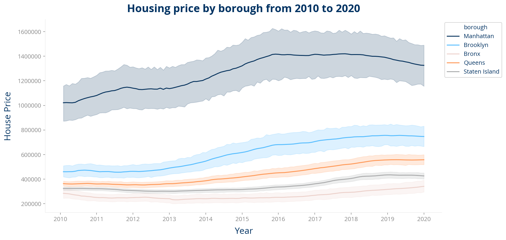
# Median housing price within boroughs from 2010 to 2020
plt.figure(figsize=(12,6))

themes.theme_ucberkeley()
data = z_nyc[z_nyc['zipcode'].isin(newdata_2020.zipcode.unique())]

sns.lineplot(data = data, x='yr_mth', y='value',hue='borough',
             palette=self_palette,
            )
plt.xlabel('Year',fontsize=15,labelpad=8)
plt.ylabel('House Price',fontsize=15,labelpad=8)
plt.title('Housing price by borough from 2010 to 2020',fontsize=18, y=1.02,weight='bold')

plt.legend(loc='upper right')
plt.legend(loc='upper left',bbox_to_anchor=(1, 1))

plt.show()
Look at colors in box-plot
# Airbnb median rental price across boroughs in 2019
plt.figure(figsize=(15,9))
themes.theme_ucberkeley(scheme="all")
df = newdata_2020[np.abs(newdata_2020.price-newdata_2020.price.mean())<=(4*newdata_2020.price.std())]
# Remove records with listing prices that are more than 3 standard deviations from the mean
sns.catplot(x='borough', y="price", kind="boxen", data=df, palette = self_palette,
            height=5, # make the plot 5 units high
            aspect=2.5) # height should be 3 times width
plt.xlabel('borough',fontsize=12)
plt.ylabel('Listing Price',fontsize=12)
plt.title('Rental price across neighborhoods',fontsize=18, y=1.2, weight='bold')
plt.show()

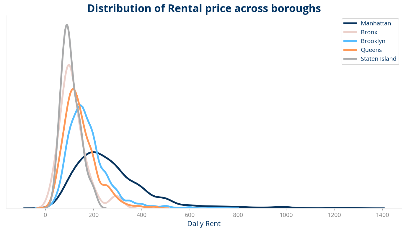
- And if we want to do multiple histgram in the same plot
plt.figure(figsize=(12,6))
themes.theme_ucberkeley(scheme="all")
b1 = newdata_2020.loc[newdata_2020['borough'] == 'Manhattan']
b2 = newdata_2020.loc[newdata_2020['borough'] == 'Bronx']
b3 = newdata_2020.loc[newdata_2020['borough'] == 'Brooklyn']
b4 = newdata_2020.loc[newdata_2020['borough'] == 'Queens']
b5 = newdata_2020.loc[newdata_2020['borough'] == 'Staten Island']

g=sns.distplot(b1[['price']], hist=False, rug=False,
             kde_kws={ 'color':'#07335d', "lw": 3, "label": "Manhattan"})
sns.distplot(b2[['price']], hist=False, rug=False,color='#ecd1cb',
             kde_kws={ "lw": 3, "label": "Bronx"})
sns.distplot(b3[['price']], hist=False, rug=False,color = '#56bdff',
            kde_kws={ "lw": 3, "label": "Brooklyn"})
sns.distplot(b4[['price']], hist=False, rug=False,color='#ff9856',
            kde_kws={ "lw": 3, "label": "Queens"})
sns.distplot(b5[['price']], hist=False, rug=False,color='#a9aaab',
            kde_kws={ "lw": 3, "label": "Staten Island"})
plt.tick_params(
    axis='y',          # changes apply to the x-axis
    which='both',      # both major and minor ticks are affected
    bottom=False,      # ticks along the bottom edge are off
    top=False,         # ticks along the top edge are off
    labelbottom=False) # labels along the bottom edge are off

g.set(yticks=[])
plt.xlabel('Daily Rent',fontsize=12)
plt.title('Distribution of Rental price across boroughs',fontsize=18, weight='bold')
plt.show()
fig, (ax) = plt.subplots(1, 1, figsize=(10,6))
themes.theme_ucberkeley(scheme='all')
df=pay_2020.sort_values(by='payback_time').iloc[:10,]
sns.barplot(x='zipcode',y='payback_time',
            hue="borough",palette=self_palette,
            dodge=False, order=df['zipcode'],alpha=.8,
            data=df)

plt.title('Payback years by zipcode (top10)',fontsize=15, y=1.02, weight='bold')
ax.legend(title="Borough", fontsize=9)
ax.tick_params(axis = 'both', which = 'major', labelsize = 12,colors='#333333',)
ax.tick_params(axis = 'x', which = 'major', labelsize = 12,colors='#333333',rotation=90)
plt.axhline(med_payback, ls='--',lw=2,c='#ffc107')
plt.xlabel('zipcode', fontsize=12)
plt.ylabel('Pay back years', fontsize=12)
#plt.text(1, -25, "Fig 1. Number of properties by zipcodes", fontsize=10, ha="center")
plt.show()

Be safe.